 Our brand
This is what AhorryGo looks (and sounds) like
Ahorry, the colors, the type and the tone we use — all in one place so anyone can represent the brand well.
AhorryGo
Wordmark
AhorryGo's name, always written as one word.
AhorryGoHorizontal lockup
Icon and name side by side, built for bars and headers.
AhorryGoVertical lockup
Icon and name stacked, for tall layouts.
Icon
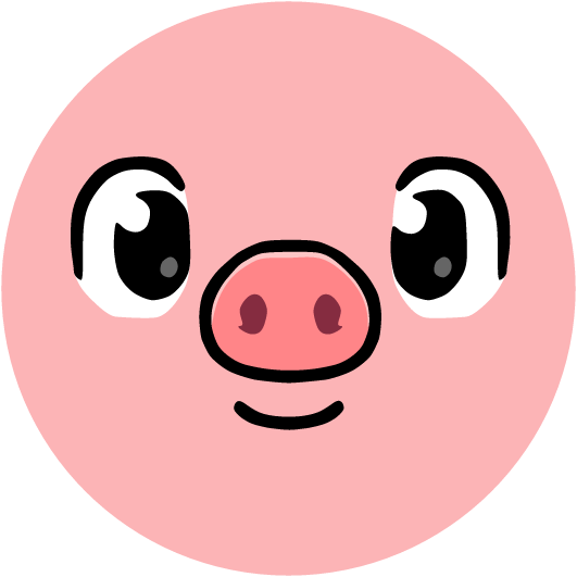
Ahorry inside his circular mark.
Color
Dark green, lime and mint: the official palette.
Aa
Typography
One single typeface for the whole brand.
Illustrations
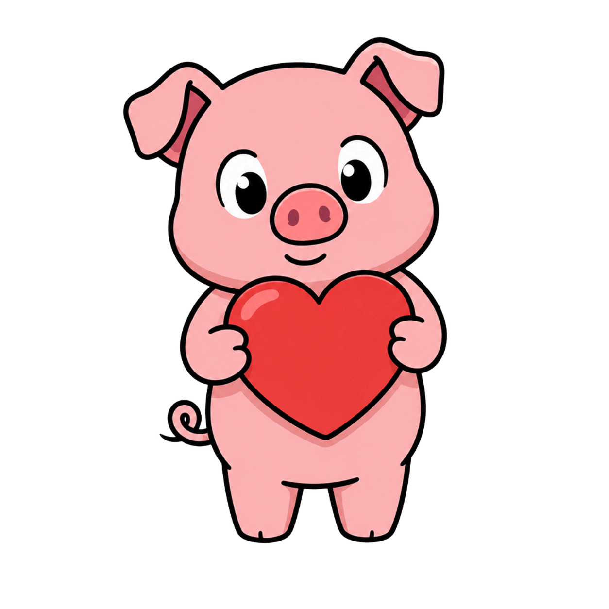
Ahorry's scenes across the product.
Meet Ahorry
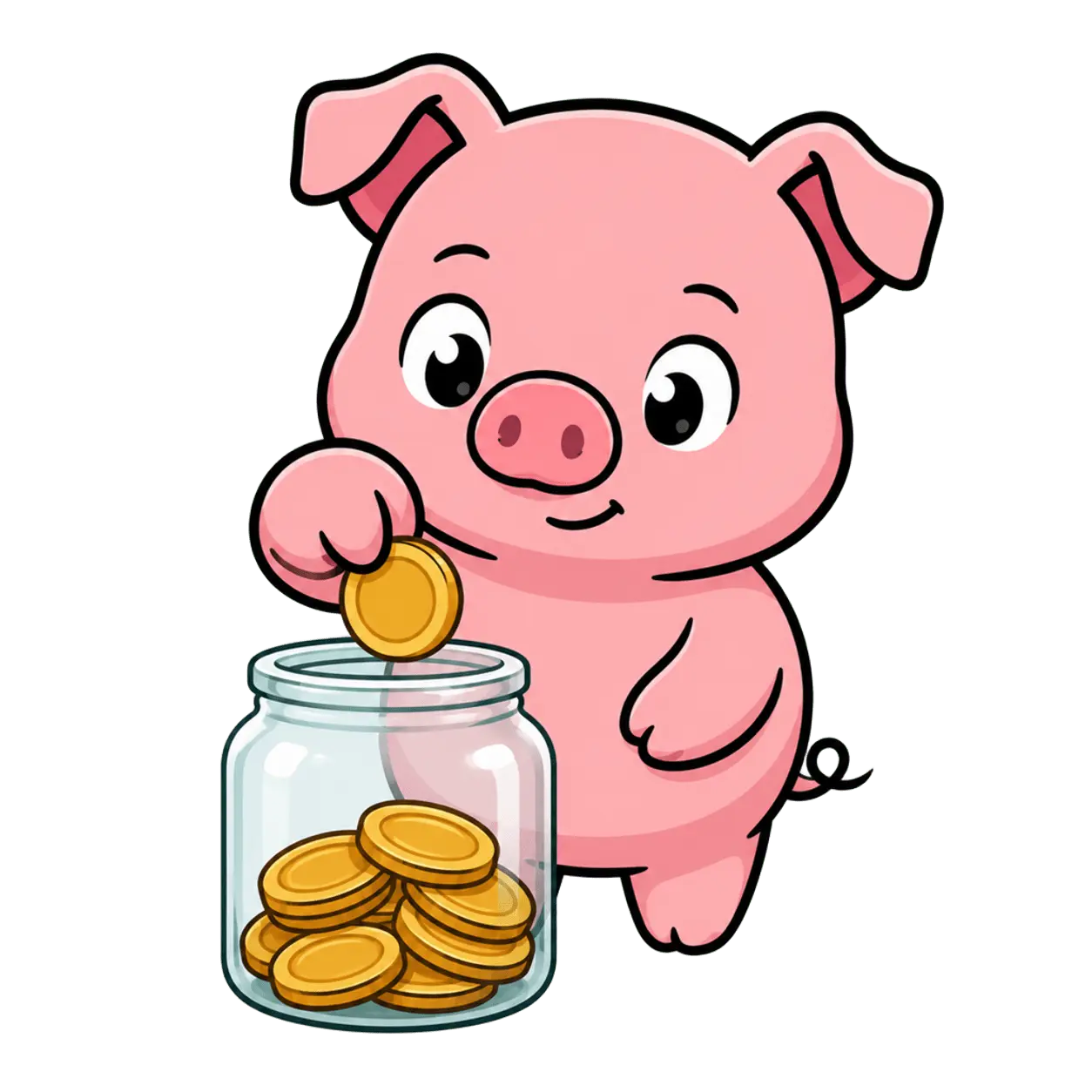
For now, Ahorry is the only character we have.
Voice & tone
How AhorryGo sounds when it writes.
Illustration style
The rules for drawing Ahorry.
Marketing
What the brand looks like outside the product.
Resources
Every file, ready to download.